Product · Data visualisation · 3D · Alert design
From a grid of plant photos to a 3D map of the crop
2 min read
Role
Product, design and build
Timeline
2026
Scope
Product · Data visualisation · 3D · Alert design
Industries
Indoor vertical farming
Outcome
The farm’s daily plant health review, on one screen

The crop as terrain, each plant’s canopy setting the height of its tray
A daily health check of every plant, on one screen
Plant health is the view where AGEYE’s daily plant scans become a decision. It draws the crop as a 3D terrain, with every plant measured for canopy area, height, greenness and canopy temperature and read against the plants around it, so the ones falling behind surface without anyone searching. I planned, designed, built and shipped it, working with AI coding agents.

One level at a time, tray by tray
The brief
ARIS, AGEYE’s multispectral imaging rig, was built in house from scratch and scanned the racks every day. What it produced reached the grower as a grid of photo cards, one per flagged plant, each carrying an anomaly score. A card could point at a single plant. It could not show how that plant compared with its neighbours. Most underperformers only show up in that comparison. Yield and delivery dates are committed weeks in advance, so a problem found a week late becomes a short shipment.

A card holds one plant’s whole history, and nothing about the plants beside it

The comparison a card cannot make: every tray on a level, against the others
The solution
The goal was to reduce the visual load of a very large amount of data. The question I designed around was how a grower could see the state of every plant without reading a table for each one, or walking the rows to look at them. Plotting each measurement as physical height, and colouring the same surface as a heat map, turns that comparison into something the eye does at a glance.
Each tray is rendered as a continuous surface interpolated between plant positions, and each plant’s measurement sets the height of the surface where it sits. A plant smaller than its neighbours appears as a dip, and a tray falling behind its level sits visibly lower than the trays beside it. The metric is selectable between canopy area, height, greenness and canopy temperature, so the same rack can be read four ways.
The terrain can be read across a whole rack in 3D or one level at a time as a filmstrip, and flat heat tiles show every tray on the farm at once. Plant health alerts also surface in the digital twin, so crop condition is read on the same model as the environment that shapes it.

The same rack read four ways: canopy, height, greenness, temperature
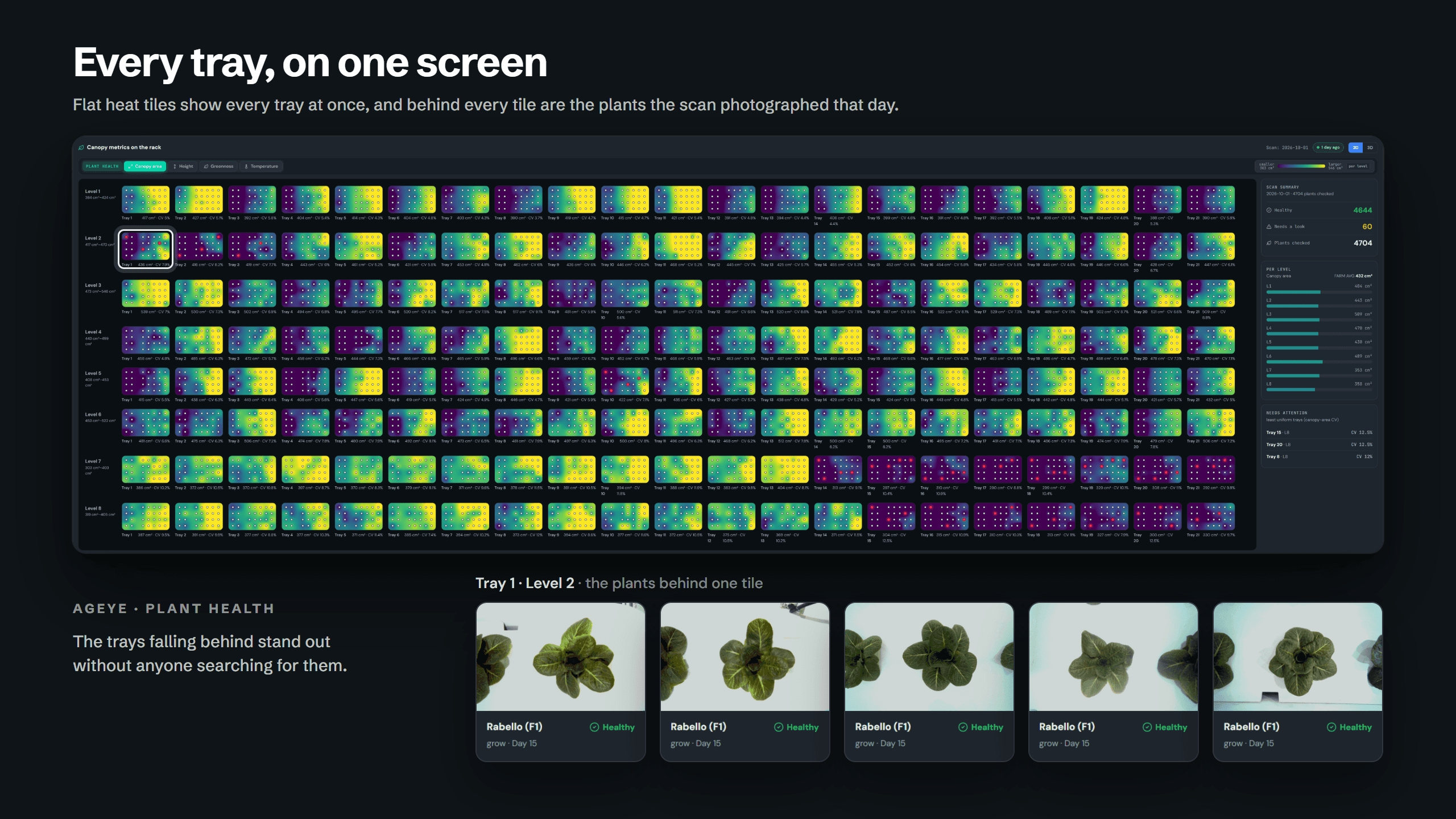
Every tray on the farm, on one screen
every plant the rig reaches, imaged and measured
metrics on every plant: canopy area, height, greenness, temperature
environment readings joined to the daily image record
The impact
Scouting goes where the data points
The daily crop review is now one screen: the terrain, and at most one alert. It used to be a scroll through every flagged photo, with every comparison held in the grower’s head, which made a plant falling behind very difficult to spot. Problems that only exist in comparison now appear on the page without anyone searching for them.
Checking the crop by eye on the floor was never a real alternative at this scale. A room of more than sixty thousand plants, checked at even two seconds a plant, is more than thirty hours of looking, the full working day of four people, every day. So scouting sampled a few trays and missed the rest, where the terrain now covers every plant the rig measures.
Five detectors run on every scan, and I allowed only one to raise an alert: a tray falling below three quarters of its level median. On a healthy day the page stays quiet, which is why the alert that does appear gets acted on. ARIS was always collecting this data. Plant health is what turns it into caught problems and protected delivery dates.

Crop condition read on the same model as the climate that shapes it