Brand identity · Web design
Brand identity for produce grown in indoor vertical farms
3 min read
Role
Brand identity and Website Design
Timeline
2023
Scope
Brand identity · Web design
Industries
Indoor vertical farming
Outcome
Full brand system, made in three weeks

A shelf brand for food grown indoors
Moonshot Farms grows produce indoors under lights and sells it in ordinary supermarkets. I built the brand: the logo, the palette, the typography, a modular campaign line system and the website, working directly with the founders and the growers across three weeks. Indoors is the whole difference, and the claim the brand makes is that indoor growing produces better food than field or organic, so a pack has about a second on the shelf to make that claim and be believed.

Brand website on laptop and tablet with Healthier inside and Greener inside
The brief
Agricultural packaging runs on one set of images: soil, sunlight, hand lettering, heritage. Moonshot Farms could not use any of it honestly, because the product is grown indoors and the true story is the opposite of rustic. The brand had to stand out on the shelf and teach at the same time.
Research set three constraints.
Supermarket shoppers decide in seconds.
Organic does not automatically read as better.
Shoppers were already curious about local and sustainable alternatives.
Together those describe a brand that has to be bold, educational and easy to approach in a weekly shop.
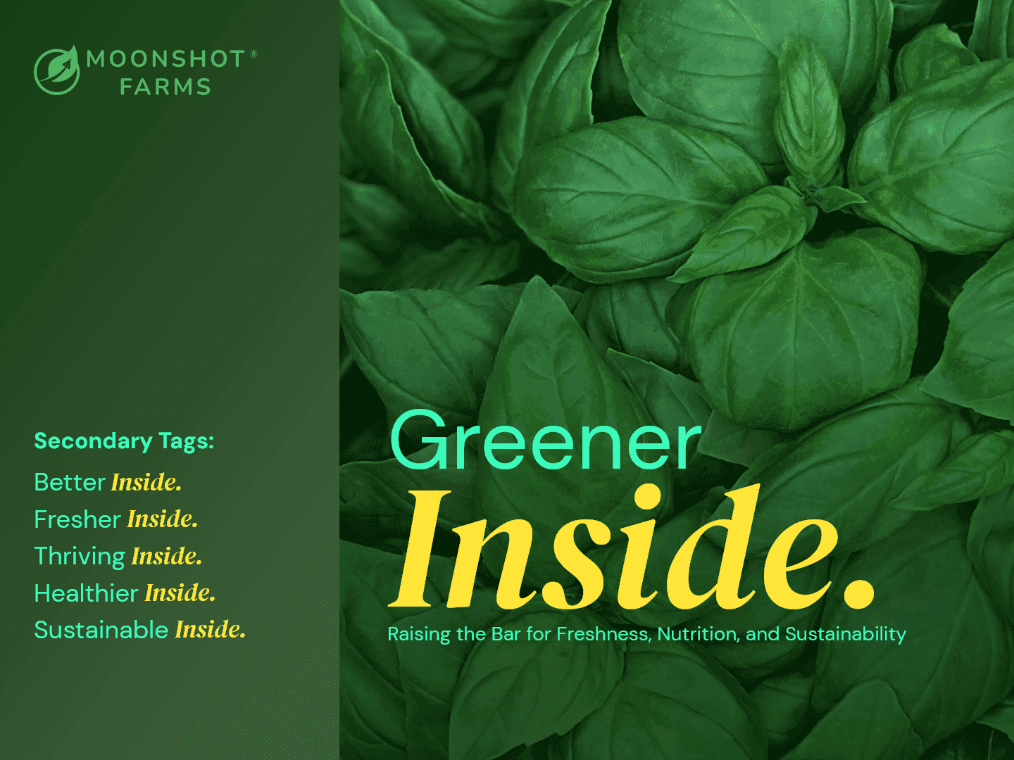
Brand's Secondary Inside tag lines

Brand palette of four colors with DM Sans and DM Serif Display
The solution
The system runs on the word Inside. It is where the food is grown and also what is different about it, so it works as a place and as a claim at once. I built a modular line system on it: Greener Inside, Fresher Inside, Healthier Inside. Inside holds the same position and the same weight in every lockup, so a shopper who has seen one pack recognises the next one from down the aisle even though the first word has changed.
The rest of the identity keeps innovation and warmth in balance. The mark is a rocket inside a circle, plant motifs sit around it, and the four brand colours read as food rather than as technology. DM Serif Display sits over DM Sans, the serif carrying the warmth and the sans carrying the information.

The process
Agricultural brands fall into two piles. Industrial ones talk to buyers in tech speak. Rustic ones talk down to shoppers with folksy farm imagery. Neither is addressed to a person choosing what to eat this week, and that gap is where this brand went.
Working with the growers supplied what to fill it with. Water efficiency, harvests all year round and no pesticides are not marketing lines, they are what the farm does differently from a field. That settled the strategy: present indoor farming as the next version of farming rather than an alternative to it.

Brand deck spread showing web and mission pages
Discovery to delivered system
Logo, palette, campaign system, website
The impact
What the system does now
The identity holds from a social post to a street hoarding, which is the real test of a modular system: the same word carrying the weight, the same construction, at every size. Website, packaging lines and campaign posters all come out of one kit, so the founders can produce new material without a designer in the room.
The numbers the farm sells on are real and specific: 90 percent less land than field growing, 98 percent less water, 95 percent fewer food miles. None of them belong to the identity. The identity’s job was to make them land in the second a shopper gives the shelf, which is why the system leads with Inside and lets the evidence follow rather than opening with a statistic nobody stops to read.
What the brand did to sales is not mine to report, because those figures were never shared.

Wall of posters with the Inside campaign lines